A practitioner's notebook covering the full AI-assisted design workflow , from distilling the design brief to production-ready Figma screens. Based on real workflows by working designers in 2026.
Unified Workflow: Brand → Visual → Prototype → Audit
Gen AI Tools: Claude / Weavy AI / Google Stitch / Gemini / Figma MCP
This UI/UX design playbook is for product designers, design leads, and founding teams who want to use AI tools to go from a client brief to production-ready screens without losing creative control. You should be comfortable with Figma and willing to learn node-based tools like Weavy AI. No ML or prompt engineering background is needed. We have provided field-tested prompts along with easy-to-follow instructions to avoid the overwhelm.
How to Use This Guide
Follow the phases in order the first time. Each phase produces a specific deliverable that feeds into the next. Once you've completed one full pass, you'll know which phases to revisit and which to skip on future projects.
If you have less than 2 hours: Jump to the Quick-Start Checklist at the end and run the minimum viable workflow.
If you're doing this for a client: Follow every phase. The deliverables at the end of each phase are your review checkpoints , don't move forward without sign-off on the current phase's outputs.
If a prompt fails: Every prompt section includes guidance on what to try next. AI outputs are probabilistic, so carry out 2–3 iterations. You can also use Claude, ChatGPT, or Gemini to check their output before you land on something usable.
About this Notebook
This playbook is structured to provide steps, tools, and prompts that will allow product designers to deliver web and mobile apps with AI. It distils the best practices from professional AI-assisted design workflows into one unified, end-to-end path from product/idea brief to production-ready screens.
The workflow follows a clear sequence:
Brand Strategy → Visual System → Rapid Prototype → Compositing → AI Audit.
Each phase has a dedicated tool, and each tool earns its place by doing one thing better than any alternative.
Golden Rule , "Decide what you want to outsource and what you don't. Outsource solved problems , but your unique take on how it should feel is too important to outsource."
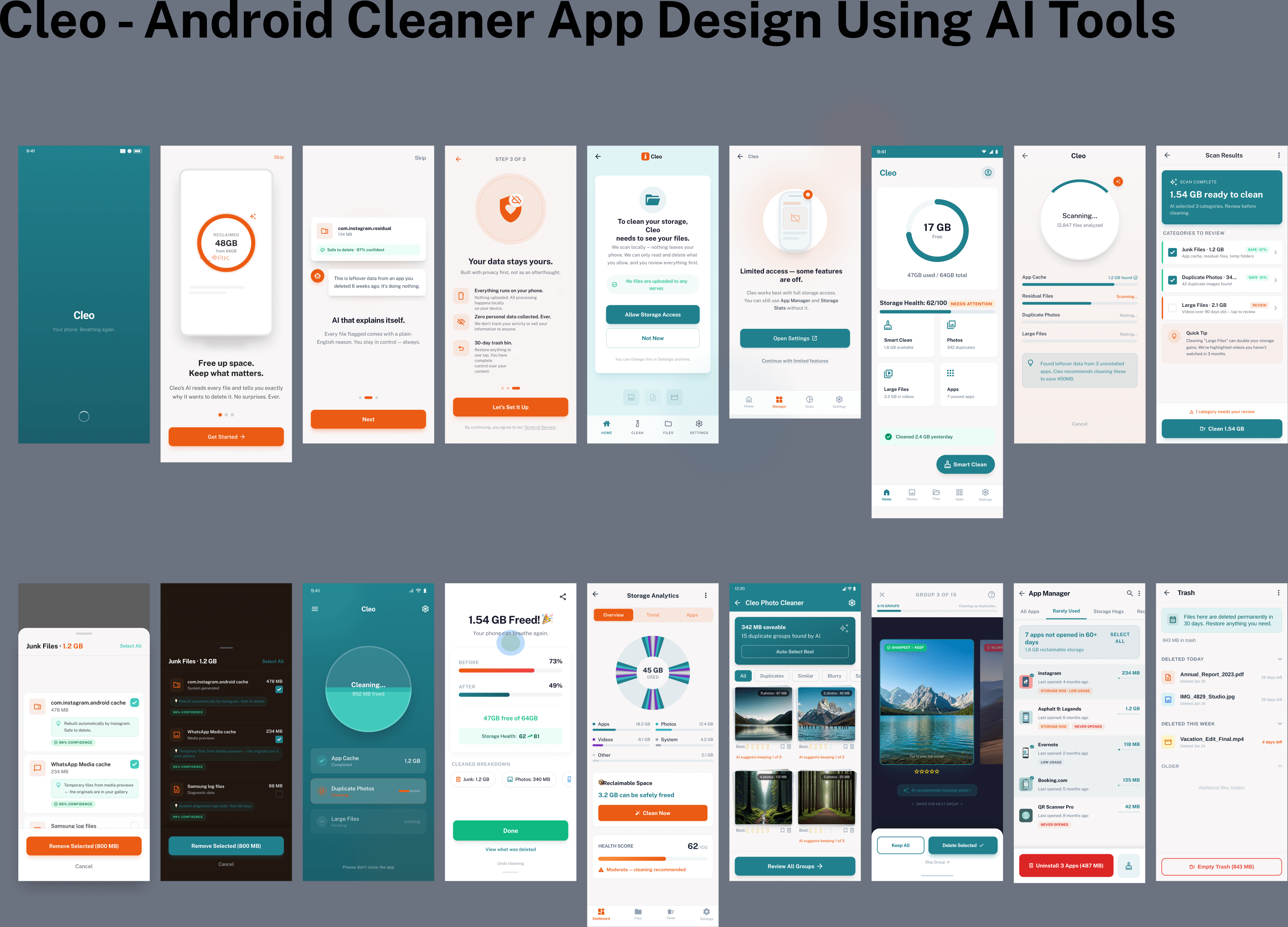
Project Brief: We are going to design an AI-Powered Android Cleaner App following the brief as provided by the client:
Build an AI-powered mobile cleaner that scans storage, identifies junk with confidence scoring, detects duplicate photos by quality, and cleans in under 30 seconds , all processed on-device. Zero data leaves the phone.
Problem we're solving
Existing cleaners are ad-heavy, use fake performance metrics, or delete files without explanation. Users don't trust them. We need a cleaner that earns trust through transparency , every flagged file shows a reason and a confidence score.
Target users
Mid-range Android owners (64GB, 4GB RAM) are hitting storage warnings. Photo-heavy users with hundreds of duplicates across WhatsApp and the camera. Tech-savvy users who want control and privacy.
Core experience
The app should provide one-tap smart cleaning of storage, settings, residual and bot removal. Scan → Review with AI explanations → Clean → Before/after summary. 30-day trash bin as a safety net.
Revenue model
Freemium pricing model offering Free tier (3 cleans, non-intrusive ads) · ₹25 per pro session · ₹300/year unlimited with vault, scheduling, and priority support. UPI-first for the Indian market.
Tech Stack and Constraints
Kotlin, Jetpack Compose, TensorFlow Lite, MVVM architecture. All ML inference on-device. Must perform well on 2–4GB RAM devices.
What This Playbook Will Produce
By the end of this workflow, you'll have:
- product/idea brief + brand guidelines , The strategic foundation that keeps every AI output on-brand
- Mood board , 8–12 curated references with one hero image anchoring the visual system
- Visual asset library , colour palette, CTA button, background textures, data visualisation assets, and logo , all generated in Weavy AI
- Functional prototype , One-shot prototype from AI Studio or client-ready web concept from Stitch
- Composited Figma screens , Production-ready frames with all assets assembled, typography applied, and spacing polished
- AI audit report , Automated design system compliance check with zero critical violations
Full AI Design Workflow Map
One path, six stages: from feeling to production-ready UI that doesn't look like a robot made it.
Design Brief Mood Board Visual Assets Prototype Composite AI Audit Claude Cosmos Weavy AI Stitch / Google AI Studio Figma Claude, Google AI Studio
The 2026 AI Design Tool Arsenal
Each tool occupies a specific role. Using the wrong tool at the wrong stage is why most AI-generated designs look generic.
Beginner? Start with just Claude + Weavy AI + Figma. That's the minimum viable stack. Add Stitch and Cosmos as you get comfortable.
Power user? Run Weavy in parallel with multiple models, use Cursor + MCP for automated audits, and connect Stitch's Figma export directly into your compositing workflow.
Tool Role Description Google Stitch Concept Generation Best tool for spinning up client-ready web and mobile concepts. Confirms implementation plan, builds mobile-responsive designs, tests in Chrome, and iterates with you. Far superior to Figma Make. Claude Brain / Strategy Best brainstorming partner. Use for product/idea briefs, brand guidelines, generating prompts for other tools, refining thinking, and negative prompt generation. Weavy AI Visual Asset Gen Node-based creative platform (now part of Figma) with access to all major AI models , Flux Pro, Ideogram v3, Stable Diffusion, Imagen 3, and more , plus professional editing tools like inpaint, upscale, relight, and background removal. Run multiple models in parallel to find the best output. weavy.ai Google AI Studio One-Shot Prototype Best for one-shot end-to-end UI prototyping. Especially strong at shaders and complex animations. Use when you just want to see the whole thing fast. Cosmos Mood Boarding Premium Pinterest alternative for visual inspiration. Cluster-based discovery. Build mood boards that feed directly into Weavy AI. Critical for developing your own taste. Figma + MCP Compositing + Audit The final home of your designs. Use for compositing assets from Weavy AI, applying typography, and running AI audits via MCP to catch spacing/variable violations. Cursor / Claude Code Code + Audit Engine Connect to Figma via MCP for design auditing. Claude Code is the #1 pick for production apps. Use the Cursor with the Gemini model for UI-heavy work and plan mode.
Phase 1 · Brand & Emotional Strategy
"Most people vibe code what it does. Nobody thinks about how it should make someone feel. That's why everything looks the same."
That’s the pitfall most people have observed using products designed using AI tools. Jumping straight into a UI generator with "build me a [X] app." You get functional but generic output.
The best way to avoid a generic design is to answer two questions: Who is this for? And how should it make them feel? These answers will govern every creative decision downstream.
Step 1A · Define the product/idea brief
Think like a movie director. A film has a beginning, middle, and end. Your app’s first impression determines whether someone downloads it, uses it, and continues using it, as it is largely influenced by how your app design makes them feel. Work backwards from the feeling you want to create.
- Name your user , Not "people who want to clean their phone."
Be specific: "someone whose 64GB phone is constantly full, gets anxious seeing storage warnings, takes hundreds of photos but never deletes, and doesn't trust cleaner apps because they feel scammy." - Define the feeling, not the feature , Yes: Instant relief.
Visible progress. Trustworthy intelligence. Not: scan files, delete cache, show charts. Think of the satisfaction of pressure-washing a driveway or decluttering a room. Film, TV, and physical products are great reference points. - Define what it is NOT , This is as important as what it is.
Not a bloatware utility. Not ad-heavy. Not scary or aggressive. Not a "booster" or "optimizer" with fake metrics. These "nots" eliminate entire categories of generic cleaner UI patterns.
PROMPT 1 , product/idea brief Generator
Tool: Claude | Stage: Brand Strategy
I'm designing a [product type] for [specific user description]. Help me define how this product should make someone feel. Consider: - Who is the core user? What are they tired of? What do they crave? - What emotions should the product trigger on first open? - What should this product NOT feel like? (give me anti-examples) - What are 3 visual/sensory metaphors that could anchor the brand? - What is it NOT? (list product categories it should actively avoid resembling) Format as: 1. Core user insight (2-3 sentences) 2. Desired emotional state (5 keywords) 3. Anti-keywords (what to avoid) 4. Visual metaphors 5. Brand positioning sentence.
Example output (AI-Powered Android Phone Cleaner):
- Core user: The storage-stressed mid-range Android user. Constantly hitting "storage full" warnings. Downloads many apps, takes hundreds of photos, never organises. They want a quick fix without the fear of losing important files.
- Desired state: Relief. Trust. Clarity. Speed. Control.
- Anti-keywords: Aggressive. Scammy. Ad-heavy. Fake metrics. Bloatware.
- Visual metaphors: Teal water washing clean. Breathing space. Health dashboard. Before/after transformation
- Positioning: "The AI cleaner that actually explains what it's deleting , so you free up space without the anxiety."
If this prompt produces generic or unfocused output: Your user description is probably too broad. Replace "people who need phone storage" with a specific person: their device, their frustration, their daily habit. Also, try feeding Claude 2–3 screenshots of competitor apps and asking, "how should our product feel different from these?"
Step 1B · Build the Mood Board
A mood board is a conversation, not a deliverable. It helps you draw inspiration, and it sharpens your creative instinct by forcing you to choose, not just collect.
With the added ability to directly feed into AI tools like Weavy, if you aggregate and generate a high-quality mood board, it can help you determine the quality of every generated asset downstream.
It's the fastest way to get everyone, designers, stakeholders and developers, looking at the same picture before a single pixel gets pushed.
Always think in two layers: vibe boards that capture the overall feeling and emotion of the brand, and tactical boards that zero in on specific decisions like colour, typography, layout, and iconography. Skip the vibe, and everything looks disconnected. Skip the tactical, and you never get sign-off on anything concrete.
Choosing Your Platform
Three platforms dominate the moodboarding space. Each has a clear strength. Use one, or use all three for different purposes.
Pinterest , The largest visual library with the smartest algorithm. When you start pinning images to a board, the "Find ideas for this board" feature serves up hyper-relevant suggestions based on what you've already collected. No other platform matches this level of algorithmic discovery.
Best for: Getting started fast, broad visual exploration, building large reference sets.
Cosmos (cosmos.so) , A smaller, more curated platform with a design-forward community.
Best for: Colour exploration, curated high-quality references, design-specific inspiration.
Are.na (are.na) , The platform where professional art directors, creative directors, and brand strategists do their real work. The content quality is a tier above everything else because the community is smaller and deeply intentional.
Best for: Advanced creative research, finding original references, agency-level brand work.
Pro tip , Spend 30–45 minutes creating and reviewing your mood board to determine what images, designs, and colour palettes best resonate with your app positioning, mood and liking. Decide what to keep, what to move to a project board, and what to delete. Organised references compound over time. Unreviewed bookmarks are just digital clutter.
How to Build the Board
- Search using visual metaphors from your product/idea brief , For the AI Cleaner app, search terms like "clean dashboard UI," "teal gradient mobile app," "storage visualization," "minimal utility design," and "health score interface." Let the clusters pull you into unexpected but cohesive territory.
- Find ONE hero image , Find one image you love and build the entire visual system around it. Don't rush past this step. Jony Ive based an entire product line on Dieter Rams. One image, whole brand.
- Save 8–12 images, all cohesive with the product/idea brief , These go directly into Weavy as input images. Every generated asset will pull from these references.
- Organise by intent , Separate your overall brand feeling from your tactical references, specific UI patterns, colour combos, icon styles.
- Use the board as a conversation tool , Add and eliminate images with your stakeholders in real time. "This blue is too aggressive , remove it." "We never want to go full white , only light grays." "Add that one , it captures the trust we're after." The board evolves through discussion. That's the point.
North star check , Every time you're unsure whether a Weavy AI output is right, ask: "Does this match how I want my user to feel?" Go back to your product/idea brief. This is your creative compass throughout the entire process.
Step 1C · Generate Brand Guidelines via Claude
Brand guidelines are not corporate documents. They are a creative prompt you'll feed into Weavy and AI Studio. Think of them as a design system in plain English.
PROMPT 2 , Brand Guidelines Generator
Tool: Claude | Stage: Brand Strategy
My app is called [App Name]. Based on this positioning: "[Paste your positioning sentence from Prompt 1]" Write me concise brand guidelines covering: - Brand voice (3-5 adjectives) - colour direction (warm/cool/neutral, primary mood) - Typography direction (modern/serif/handwritten/monospace?) - UI texture direction (flat/textured/minimal/maximalist?) - Animation style (snappy/slow/none/organic?) - Key visual metaphor (the one thing that anchors the visual system) - What the brand celebrates - What the brand rejects Keep each section to 2-3 sentences max. These will be used as prompts in an AI image generation tool.
If this prompt produces vague or generic output: Add 2–3 competitor names and say "differentiate from these." Include your anti-keywords from Prompt 1. The more specific your positioning sentence, the sharper the guidelines.
Phase 1 · Exit Criteria
Before moving to Phase 2, confirm you have these deliverables:
- [ ] product/idea brief with 5 keywords, anti-keywords, visual metaphors, and positioning sentence
- [ ] Mood board with 8–12 cohesive images and one clear hero image
- [ ] Brand guidelines document covering voice, colour, typography, texture, and animation
- [ ] Stakeholder sign-off (or your own gut check) that the mood board matches the product/idea brief
If any of these feel weak, iterate before moving forward. Phase 2 will amplify whatever you feed it , including mistakes.
Phase 2 · Weavy AI Visual System
Weavy (weavy.ai) is a node-based creative platform that gives you access to all major AI models and professional editing tools in one workspace. It may look intimidating at first, but with Claude writing your prompts, it becomes the most powerful visual design tool in this stack.
Use Claude to generate the prompts. You don't need to know how to write great prompts. Ask Claude: "Write me a Flux/Ideogram prompt for [X]." Then paste it into Weavy. Claude + Weavy = the secret weapon.
How Phase 2 Works
Think of this phase as building a visual vocabulary , not designing screens. You're generating the raw ingredients (palette, buttons, textures, icons, logo) that will be assembled in Figma later. Work in this order because each asset builds on the previous one:
colour palette → CTA button → Background texture → Data visuals → Logo
Run 2–3 variations of each asset in parallel. Compare against your mood board. If an output doesn't match the product/idea brief, don't iterate endlessly , go back to Claude and ask it to rewrite the prompt.
Model guide for Weavy:
- Flux Pro 1.1 Ultra , Default model for image generation. Use for: colour palettes, UI assets, buttons, background textures, any visual component generation
- Ideogram v3 , Logo and typography work. Exceptional at text rendering inside images. Always pair with a negative prompt.
- Imagen 3 / Recraft V3 , Alternative models available for different aesthetics. Run in parallel with Flux to compare outputs.
Built-in editing tools: Inpaint, outpaint, upscale, relight, background removal, mask extraction, z-depth, and more , all connectable as nodes in your workflow.
Step 2A · Colour Palette Generation
Start with colour. It's the most foundational design decision and the easiest to generate in Weavy. Always run 2–3 variations simultaneously and compare against your product/idea brief.
PROMPT 3 , Colour Palette from Mood Board Image
Tool: Weavy AI (Flux Pro 1.1 Ultra) | Input: mood board image
# Variation A , Direct extraction:
Extract a UI colour palette from this reference image. Show 5-7 swatches arranged as a horizontal palette strip. Include primary, secondary, accent, background, and text colours. Label each swatch with its hex value.
# Variation B , Mood-enhanced:
Give me a colour palette based on this image, but make it clean and modern with a teal/green focus. Show as swatches with hex values. The palette should feel [fresh/trustworthy/calming/etc].
# Variation C , Elevated:
Extract the emotional colour story from this image. Translate into a minimal UI palette: 1 dominant background, 2 midtones, 1 accent, 1 highlight. Add a subtle gradient overlay to make it feel polished and premium.
Step 2B · UI Asset Generation (Buttons, Icons, Components)
Generate key UI components as visual assets. Think in layers: CTA button → background texture → storage chart → category icons. Build the visual vocabulary piece by piece.
PROMPT 4 , Primary CTA Button
Input: colour palette image + reference image
Generate a [clean now / scan / optimize] button for a mobile cleaner app. Inspired by [reference image/health dashboard / satisfying UI]. It should feel like tapping it triggers instant relief -- clean, confident, modern. Use this exact colour palette: [paste/attach colour palette]. Isolated on a transparent background. Satisfying to press -- conveys trust, speed, and progress.
PROMPT 5 , Background Texture / Hero Visual
Generate a background texture/image for a mobile cleaner app. Reference: [attach mood board image]. Style: [clean gradient/subtle geometric/minimal texture]. colours must match this palette: [attach palette]. Should feel [fresh/trustworthy/modern/spacious] not cluttered or aggressive. Suitable as a full-screen app background.
PROMPT 6 , Visual Metaphor for Data
Generate a set of [storage category icons/donut chart segments/file type cards] using this colour palette. Show them as [icon grid / stacked cards/pie chart breakdown]. They represent individual [junk files/photos/apps/large files]. Style: cohesive with these reference images [attach images]. Each category should look visually distinct but part of one system.
PROMPT 7 , Add Labels to Visual Metaphor
Take this image and replace the labels on each [chart segment/category card/icon tile] with labels like: Cache 1.2 GB, Photos 3.4 GB, Apps 8.1 GB Make each label different. Keep the clean modern aesthetic. Maintain the original style and colour palette exactly.
PROMPT 8 , Background Remove (built-in Weavy AI node)
# Just connect your generated image to a "background remove" node
# No prompt needed , it's a one-click operation in Weavy
background remove
PROMPT 9 , "Before/After" Cleaning Effect
Show a before/after comparison of this [storage chart / dashboard / device screen]. "Before" should feel cluttered, heavy, red/orange warning state. "After" should feel spacious, light, green/teal success state. Preserve the original layout and composition. The transformation should feel satisfying and visually dramatic. This represents [the result of one smart clean cycle].
Ask Claude to improve any Weavy AI prompt: "I want a better Flux Pro prompt for getting a storage visualization that feels clean, trustworthy, and modern. Improve this prompt:"
Common Weavy failures and fixes:
- Output looks nothing like your reference: Attach the mood board image as an input node, not just describe it in text. Weavy's image-to-image pipeline is far more reliable than text-only prompts.
- colours are wrong despite specifying hex values: AI models interpret hex codes inconsistently. Instead, attach your colour palette image as a reference and say "match these colours exactly."
- Output is photorealistic when you want flat/illustrative: Add to your prompt: "flat vector style, no photorealism, no 3D rendering, clean edges." Also add these to the negative prompt.
- Multiple runs produce wildly different results: Lock the seed value in Weavy if available, or run 4–6 generations and pick the best. Inconsistency is normal , batch and select.
Step 2C · Logo Generation with Ideogram
Ideogram is purpose-built for typography and logo work. Always ask Claude for multiple logo style directions first, then run them in parallel. Always include a negative prompt.
PROMPT 10A , Ask Claude for Logo Prompt Variations
Tool: Claude → Ideogram
Write me 4 Ideogram v3 logo prompts for an app called "[App Name]". The brand positioning: "[paste your positioning sentence]" Make each prompt generate a distinctly different logo style: A. Technical wordmark -- clean, monospaced, digital-forward B. Rounded / friendly -- soft corners, approachable, human C. Shield/badge style -- trust, security, protection aesthetic D. Minimal geometric -- single shape + clean type For each prompt include: - Typography description - colour (use this palette: [describe palette]) - Mood words - Reference era or style - What to avoid (negative prompt) Format as ready-to-paste Ideogram prompts.
PROMPT 10B , Run in Weavy Using Ideogram v3 Model
Wordmark logo for "[App Name]". Style: modern utility, clean tech, friendly shield motif. Typography: rounded sans-serif, medium weight, high legibility. colour: teal (#20808D) on white, or white on dark background. Mood: trustworthy, intelligent, clean, approachable. Flat 2D. Clean edges. Suitable for app icon and lockup. # NEGATIVE PROMPT (always use with Ideogram): 3D render, glossy, gradient, drop shadow, sparkles, photorealistic, mesh, aggressive, skulls, flames, dark/scary tones, bloatware aesthetic, generic.
Phase 2 · Exit Criteria
Before moving to Phase 3, confirm you have these assets:
- [ ] colour palette image with hex values (at least one variation you're confident in)
- [ ] Primary CTA button on transparent background
- [ ] Background texture or hero visual (full-screen, matches palette)
- [ ] Data visualization assets (storage chart, category icons, or equivalent)
- [ ] Logo in at least 2 style variations (one lockup, one icon)
- [ ] All assets visually cohesive with your mood board
If assets feel disconnected from each other: You likely skipped the hero image step in the mood board. Go back to Step 1B, find one anchor image, and regenerate assets using it as the primary reference.
Phase 3 · Rapid UI Prototyping
Now that you have brand guidelines, a mood board, and visual assets , you're ready to generate the actual UI. The tools you use here depend on your goal:
Goal Best Tool Why Quick one-shot full app Google AI Studio Fastest end-to-end. Best at shaders & animations. Client-ready web concept Google Stitch Confirms plan first. Mobile-responsive by default. Best output quality. Full-stack production app Claude Code / Cursor / Loveable Production-grade. Claude Code is #1 for existing codebases. React component variations v0 (Vercel) Clean React + shadcn/ui. Copy-paste into real projects.
Step 3A · Google AI Studio for One-Shot Prototype
Use AI Studio for the first functional prototype. You're not going for beauty here , you're confirming the functionality works. Beauty comes from Weavy AI assets you'll layer in after.
PROMPT 11 , One-Shot Functional Prototype (Mobile App)
Tool: Google AI Studio | Stage: Functional foundation
Build a mobile-first [product type] app. Users can: - [Core action 1] - [Core action 2] - [Core action 3] Include screens: [Screen 1], [Screen 2], [Screen 3].
# After it generates, list the exact screens and their functions.
# DO NOT try to make it beautiful yet.
# Take screenshots of each screen for Figma.
If AI Studio produces a generic-looking app: Your prompt is too functional and not visual enough. Add your brand positioning sentence and 2–3 emotional keywords. Attach your mood board image if the tool supports it. Remember , you're not trying to make it beautiful yet, but you do want the structure to reflect your app's actual screens and flows.
PROMPT 11B , Pass Weavy AI Assets Back to AI Studio
# (After you have brand assets from Weavy)
Redesign this app using these reference assets: [attach: colour palette, button, logo, background] Apply this brand positioning: "[positioning sentence]" The app should feel: [emotional keywords] NOT feel like: [anti-keywords] Preserve all existing functionality. Only change the visual design.
Step 3B · Google Stitch for Client-Ready Web Concepts
Google Stitch is the standout tool for web UI concepts. Unlike Figma Make or Cursor, it dialogues with you before building , confirming implementation plan, colours, typography, phases, and even runs its own QA.
Stitch thinks like a designer: it plans phases (hero → content sections → social proof → polish + animation → verification), confirms details with you, builds mobile-responsive by default, and tests in a real Chrome browser. Same prompt, night-and-day difference in output quality.
Now, Stitch has also added an export to Figma feature, helping designers share and align their designs with clients and developers.
If Stitch output looks generic or doesn't match your brand: Stitch works best when you front-load specifics. Include exact hex codes, font names, and section-by-section content. If the first output misses the mark, use the iteration prompts below (Prompt 13) to refine , don't start over. Stitch improves significantly with targeted feedback.
PROMPT 12 , Web Concept for Stitch
Tool: Google Stitch | Model: Gemini 3 Pro
# Structure your prompt with these sections:
Style:
[Design direction , e.g., "futuristic SaaS," "warm editorial," "minimal fintech"]
Typography: [e.g., "geometric sans paired with a technical mono"]
colour palette: [e.g., "deep navy with electric cyan accents and warm white"]
Aesthetic: [e.g., "clean grid-based layout with subtle background texture"]
Layout:
[Overall structure , e.g., "full-screen hero, 3-column features, social proof bar, CTA"]
Navigation:
[Nav style , e.g., "transparent sticky nav with blur effect on scroll"]
Visual Elements:
[e.g., "animated gradient background, floating UI mockup in hero,
grid pattern overlay, glassmorphism cards"]
Sections:
[e.g., "Hero / Features (3-up) / How it works / Testimonials / CTA / Footer"]
# Stitch will confirm the implementation plan , review it before approving.
# It will self-organize into phases. Let it. This is the feature that makes it better.
PROMPT 13 , Iteration Prompts After First Output (Stitch Chat)
# Spacing cleanup:
Fix the spacing in the [hero/features/footer] section.
The [heading / text / CTA] is too close to the [top / bottom / edge].
Apply 80px vertical padding to all sections consistently.
Visual polish:
Add a subtle [grid pattern/noise texture/grain overlay] to the background.
Make the hero feel more dimensional , the current gradient is too flat.
Mobile refinement:
Check the mobile layout at 375px wide.
Fix any text that overflows or breaks across 2 lines awkwardly.
Ensure all CTAs are full-width on mobile.
Section replacement:
Replace the [weird image with floating widgets] section entirely.
Replace with a [feature comparison table / live demo mockup/testimonial grid].
Match the visual style of the rest of the page exactly.
Step 3C · Figma Compositing , Putting It Together
Figma is where you assemble your Weavy AI assets and Stitch design prototypes into actual screens. Think of Figma as the compositing stage in a film , all the pieces get combined here into the final picture.
- Create frames from the iOS/Android component library , Press F, select iPhone frame. Search "Android" in Figma Community for free component libraries. Add status bar, nav bar , it makes everything feel more legit instantly.
- Paste in Weavy AI assets (logo, button, backgrounds, visual metaphors) , Start with the most prominent visual , your hero image or background. Layer button, logo, and text on top. Don't try to make it perfect yet.
- Use Figma blend modes for typography colour matching , Select text layer → Appearance → try "Overlay" or "Hard Light" blend modes. The text automatically takes on the colour of whatever background it sits on. Instant visual cohesion.
- Keep typography simple and consistent , For mobile apps, one typeface, two weights (regular + medium). Never more than 3 type styles across a screen. Size: ~20px headlines, ~14px body, ~12px labels.
Phase 3 · Exit Criteria
Before moving to Phase 4, confirm:
- [ ] Functional prototype exists (AI Studio or Stitch) with all core screens
- [ ] Weavy AI assets (palette, button, logo, backgrounds) are composited into Figma frames
- [ ] Typography is applied consistently (one typeface, two weights, three sizes max)
- [ ] Screens are organized in Figma with correct device frames (Android for this project)
- [ ] Design feels cohesive with your product/idea brief , not generic, not AI-looking
If the composited design still looks "off": The most common cause is mismatched backgrounds. Ensure your Weavy background texture sits behind all elements. Try Figma blend modes on text layers. If the logo clashes, regenerate it with the exact background colour as a reference.
Phase 4 · AI Design Audit via Figma MCP
This is the workflow's secret weapon: a reusable AI command that scans your Figma designs for spacing violations, variable inconsistencies, and token detachments in about 30 seconds , saving hours of manual review before developer handoff.
AI in design is not just about building great designs with AI. It's about taking the tasks that we don't want to do and having AI do it for us. This alone saves hours and hours of work.
Step 4A · Figma MCP Setup
Connect Cursor (or any MCP-compatible IDE) to Figma so the AI can read your design files directly.
- Install Cursor from
cursor.com, Download and install. Same process works with Windsurf or Google Stitch , they're all MCP-compatible AI IDEs. - Navigate to the Figma MCP Catalog , Search "Figma MCP catalog" → find the Cursor integration → click "Add MCP to Cursor." This opens Cursor with the Figma MCP server pre-configured.
- Install MCP Server + Authenticate , Click "Install" → Cursor will prompt for authentication → click "Connect" → "Agree and Allow Access." Done. AI can now read any Figma file you share.
Step 4B.1 Create the Design Rule File
The Rule defines your design standards. The Command runs the audit against those standards. Create both once, reuse them on every project.
In Cursor: Settings → Rules, Skills & Sub-agents → Project Rule → Name: design-check
RULE FILE: design-check.mdc
# RULE: design-check.mdc
# Description: Looks at Figma designs to enforce spacing scale,
# variable usage, background token requirements, and other
# foundational design system items.
## Spacing Rules
- All outer margins (page edges) must be 16px
- All internal spacing must use spacing variables , no raw values
- Allowed spacing scale: 4, 8, 16, 24, 32, 40, 48px
(applies to: gap, padding, margin)
## Background Token Rules
- Page backgrounds: must use surface/page variable
- Card backgrounds: must use surface/default/2 variable
- Footer backgrounds: must use surface/secondary variable
- Raw hex codes on backgrounds are violations
## Variable Rules
- ALL spacing values must reference design token variables
- ALL colours must reference variables (no raw hex)
- ALL border radii must reference variables
- ALL border widths must reference variables
- ALL typography (size, weight, line-height) must reference variables
- Raw values = violation. Detached values = violation.
## Allowed Values Reference
- Border radius: 4, 8, 12, 16, 24px
- Font sizes: 12, 14, 16, 18, 20, 24, 32px
- Stroke widths: 1, 1.5, 2px
# Customize the above values to match YOUR design system.
# You can also paste your design tokens doc here directly.
Step 4B.2 Create the Design Check Command
In Cursor: Settings → Rules, Skills & Sub-agents → Project Command → Name: design-check-command
This is the reusable command that calls the rule. Write it once, use it on every Figma file forever. No need to re-explain context , it's all in the rule and command.
COMMAND FILE: design-check-command
# COMMAND: design-check-command
# Usage: @design-check-command [Figma file URL]
Step 1: Load and fully understand all provided Figma pages.
Read every page before analyzing anything.
Step 2: Walk through every frame, component, and style entry.
Do not skip any layer or nested component.
Step 3: For each item, identify and record:
\\- Spacing values (gap, padding, margins) \\- Background colour and token reference \\- Typography token references \\- Variable binding status (attached or detached)
Step 4: Compare all collected values against the design-check rule.
The rule defines all required values and token requirements.
Step 5: When a mismatch or violation is found, record:
\\- Page name \\+ Frame name \\- Layer/component name \\- Current value (what it is) \\- Expected value (what it should be) \\- Violation type (spacing/colour / variable/typography)
Step 6: After completing all frames, group issues by:
\\- Type (spacing/colour / variable/typography) \\- Severity (critical / warning/suggestion)
Step 7: Provide output as a structured list in the chat window.
Format: \\\[Severity\\\] | \\\[Page/Frame\\\] | \\\[Issue\\\] | \\\[Fix\\\]
Step 4C · Running the Audit
Once your rule and command are created, the workflow is just two steps every time:
- Copy the Figma link to your selection , In Figma: right-click any frame → Copy link to selection. Or use the full file link for a complete audit.
- Call the command in Cursor chat , Type:
@design-check-command [paste Figma URL], that's it. AI does the rest in 30–60 seconds.
If the audit returns no results or errors out: Confirm the MCP server is connected (green indicator in Cursor settings). Check that the Figma file is not in draft mode , it needs to be saved and accessible. If the file is very large (50+ frames), audit one page at a time by sharing a page-specific link instead of the full file URL.
Expected Output Format
@design-check-command https://www.figma.com/design/\[your-file-id\]/\[filename\]?node-id=...
# Expected output format from the AI:
# VIOLATIONS FOUND: 7 issues across 3 frames
# CRITICAL | Dashboard / Card Grid | background colour |
# Current: #2A2A2A (raw hex) | Expected: surface/default/2
# WARNING | Home / Hero | padding-top |
# Current: 24px (raw) | Expected: spacing/md variable
# WARNING | Home / Feature Cards | gap |
# Current: 28px | Expected: allowed values: 16, 24, 32px
Phase 4 · Exit Criteria
Before handoff to developers, confirm:
[ ] Audit has been run on all primary screens , zero critical violations remain
[ ] All colours reference design token variables (no raw hex values)
[ ] All spacing uses the defined scale (4, 8, 16, 24, 32, 40, 48px)
[ ] Typography references variables for size, weight, and line-height
[ ] Warning-level issues have been reviewed and either fixed or documented as intentional
Developer Handoff Checklist
The audit catches system-level issues, but developers also need:
[ ] Figma file link with all screens organized by flow (not scattered artboards)
[ ] Design tokens exported or documented (spacing scale, colour variables, type scale)
[ ] Interaction notes: what happens on tap, swipe, long-press for each screen
[ ] Edge cases documented: empty states, error states, loading states, permission dialogs
[ ] Asset exports: logo (SVG), icons (SVG), background textures (PNG @2x and @3x)
For this project specifically: The PRD defines a 5-phase cleaning flow (Scan → Review → Selection → Cleaning → Results). Ensure each phase has a corresponding Figma screen with clear annotations on transitions, timing, and animation expectations.
Complete Prompts Library
All prompts in one place, organized by tool and stage. Copy, customize, and use.
Claude Prompts
P-01 · product/idea brief , Claude → Brand Strategy
I'm designing a [product type] for [specific user].
Define: how it should feel, emotional state (5 keywords),
anti-keywords (what to avoid), 3 visual metaphors,
and a 1-sentence brand positioning statement.
P-02 · Brand Guidelines , Claude → Brand Strategy
App: [Name]. Positioning: "[sentence]"
Write concise brand guidelines: voice, colour direction,
typography, UI texture, animation style, key visual metaphor,
what it celebrates, what it rejects. 2–3 sentences per section.
These will be used as prompts in AI image generation.
P-03 · Logo Brief Generator , Claude → Ideogram Prompts
Write 4 Ideogram v3 logo prompts for "[App Name]".
Brand: "[positioning]". Palette: [describe].
Styles: A) Technical wordmark B) Rounded/friendly
C) Shield/badge style D) Minimal geometric
Each prompt: typography, colour, mood words, era/reference,
and a negative prompt (what to avoid).
P-04 · Improve Any Prompt , Claude → Prompt Optimization
# Use this whenever a Weavy/AI Studio output is not landing
I want a better Flux Pro prompt for achieving:
[describe what you want]
Current prompt that's not working:
"[paste your current prompt]"
Improve it for: visual consistency, correct mood,
correct colour reference, better composition.
Weavy AI Prompts (Flux Pro)
P-05 · colour Palette , Weavy AI · Flux Pro · Input: mood board image
Extract a UI colour palette from this reference image.
Show 5–7 swatches as a horizontal strip with hex values.
Include: primary, secondary, accent, background, text.
Style: [fresh/clean/teal-forward/modern/etc].
P-06 · Primary CTA Button , Weavy AI · Flux Pro · Input: colour palette + reference
Generate a [clean now/scan/optimise] button for a mobile cleaner app.
Inspired by [reference image/health dashboard / satisfying UI].
Modern, confident, trustworthy. Teal/green accent.
Use this exact colour palette. Transparent background.
Satisfying to press , conveys trust, speed, and progress.
P-07 · Visual Metaphor for Data , Weavy AI · Flux Pro
Generate a set of [storage category icons/doughnut chart segments/file type cards]
using this colour palette. Show as [icon grid/stacked cards/chart].
Each represents a [junk files/photos/apps/large files] category.
Each should look visually distinct but part of one system.
Style: clean, modern, [teal/fresh/etc].
P-08 · App Background , Weavy AI · Flux Pro
Background texture for a mobile cleaner app. Full-screen.
colours from this palette. Style: [clean gradient/subtle geometric/minimal].
Feel: [fresh/trustworthy/modern/spacious]. Not cluttered or aggressive.
Subtle texture , should not compete with foreground content.
P-09 · Before/After Cleaning Effect , Weavy AI · Flux Pro
Show a before/after comparison of this [storage chart/dashboard].
"Before": cluttered, heavy, red/orange warning state.
"After": spacious, light, green/teal success state.
Preserve layout. Transformation should feel satisfying.
Represents [the result of one smart clean cycle].
Weavy AI Prompts (Ideogram v3 , Logo)
P-10 · Modern Utility Logo , Weavy AI · Ideogram v3 · Always include negative prompt
Wordmark logo for "[App Name]". Style: modern utility,
clean tech, friendly shield motif.
Typography: rounded sans-serif, medium weight, high legibility.
colour: teal (#20808D) on white. Flat 2D. Clean edges.
Suitable for app icon and full lockup.
Negative prompt:
3D render, glossy, gradient, drop shadow, sparkles,
photorealistic, aggressive, dark/scary tones,
bloatware aesthetic, generic, flames, skulls.
Google Stitch Prompts
P-11 · Full Landing Page Concept , Google Stitch · Gemini 3 Pro
Style: [design direction]
Typography: [e.g., geometric sans + technical mono]
colours: [e.g., deep navy, electric cyan, warm white]
Aesthetic: [e.g., clean grid with subtle background texture]
Layout: [overall structure , hero, features, social proof, CTA]
Navigation: [e.g., transparent sticky, blur on scroll]
Visual elements: [animated gradient, floating mockup, glassmorphism]
Sections: Hero / Features (3-col) / How It Works /
Testimonials / Pricing / CTA / Footer
# Review and confirm the implementation plan Stitch generates before approving.
P-12 · Stitch Iteration Fixes , Google Stitch · Chat refinement
# Pick the fix you need:
Fix section spacing , apply 80px vertical padding consistently.
Add a subtle [grid/grain/noise] texture to the background.
Fix mobile layout at 375px , resolve text overflow and CTA sizing.
Replace the [broken/generic] section with a [better alternative].
Make the hero more dimensional , current gradient is too flat.
Google AI Studio Prompts
P-13 · One-Shot Functional Prototype , Google AI Studio
Build a mobile-first [app type]. Users can:
- [Core action 1]
- [Core action 2]
- [Core action 3]
Include screens: [Screen 1], [Screen 2], [Screen 3].
# Focus on function, not beauty. Beauty comes from Weavy AI assets.
P-14 · Apply Brand to Prototype , Google AI Studio · After Weavy AI assets ready
Redesign this app using these brand assets:
[attach: colour palette, clean button, logo, background texture]
Positioning: "[your positioning sentence]"
Should feel: [emotional keywords]
Should NOT feel like: [anti-keywords]
Preserve all functionality. Change only the visual design.
What AI Cannot Do Yet (2026)
An honest assessment of current AI limitations in design , knowing these boundaries helps you use the tools where they actually deliver.
Don't trust tools claiming "production-ready AI designs" , These are marketing claims, not reality. As of early 2026: no AI tool can build a production-ready Figma design that a senior designer would show a client without significant manual rework.
What AI Can't Do Why It Fails Current Workaround Build Figma pages that look good No understanding of the design system variable hierarchy Use Stitch/AI Studio, screenshot → rebuild in Figma Follow robust design system guidelines colours don't map to variables; auto-layout not applied Figma MCP audit + manual variable attachment Replace a designer's creative judgment AI is derivative by nature , it combines existing patterns You provide the brief, metaphor, and taste-based decisions Build consistent interactive prototypes Too much prompting required; output degrades across sessions Use Figma for compositing, AI for assets only Import cleanly to Figma from AI tools Plugin outputs break auto-layout; no variable translation Rebuild from AI output, using it only as visual reference
The Bottom Line , "AI in design is not there yet in the same way Claude Code is for engineering. But there are specific, high-value tasks , concept generation and design auditing , where it absolutely delivers. Use it for those."
Quick-Start Checklist
Your minimum viable AI design workflow from zero to client-ready. Estimated time: 4–6 hours for a first pass.
- Write the product/idea brief in Claude (P-01 + P-02) , Who is this for? How should it make them feel? What is it NOT?
- Build mood board in Pinterest / Cosmos / Are.na, find your hero image , 8–12 cohesive images. One anchor image that defines the whole visual direction.
- Generate visual system in Weavy AI (P-05 → P-10) , colour palette → CTA button → background → storage visuals → logo. In that order.
- One-shot prototype in AI Studio or full web concept in Stitch , AI Studio for mobile. Google Stitch for web. Confirm the plan before it is built.
- Composite in Figma using Weavy AI assets , Paste assets, apply typography blend modes, polish spacing. Screenshots from AI Studio as a layout reference.
- Run the AI Design Audit before handoff ,
@design-check-command [Figma URL]in Cursor. Fix violations. 30 seconds of AI saves hours of manual review.
The core principle , "Spend lots of time on your mood boards. Gather your own inspiration across Pinterest, Cosmos, and Are.na. Take one visual reference and build everything based on that. It's actually that simple , if you know what you want."
A Note on Iteration
This playbook reads as a linear sequence, but real design work is not linear. You will go back. You'll run Prompt 3 and realise your mood board was too broad. You'll composite in Figma and realise your CTA button clashes with the background. You'll run the audit and find 15 violations.
That's the process working correctly. Each phase has exit criteria precisely so you know when you're done , and when you need to loop back. The AI tools make iteration cheap. Use that advantage.